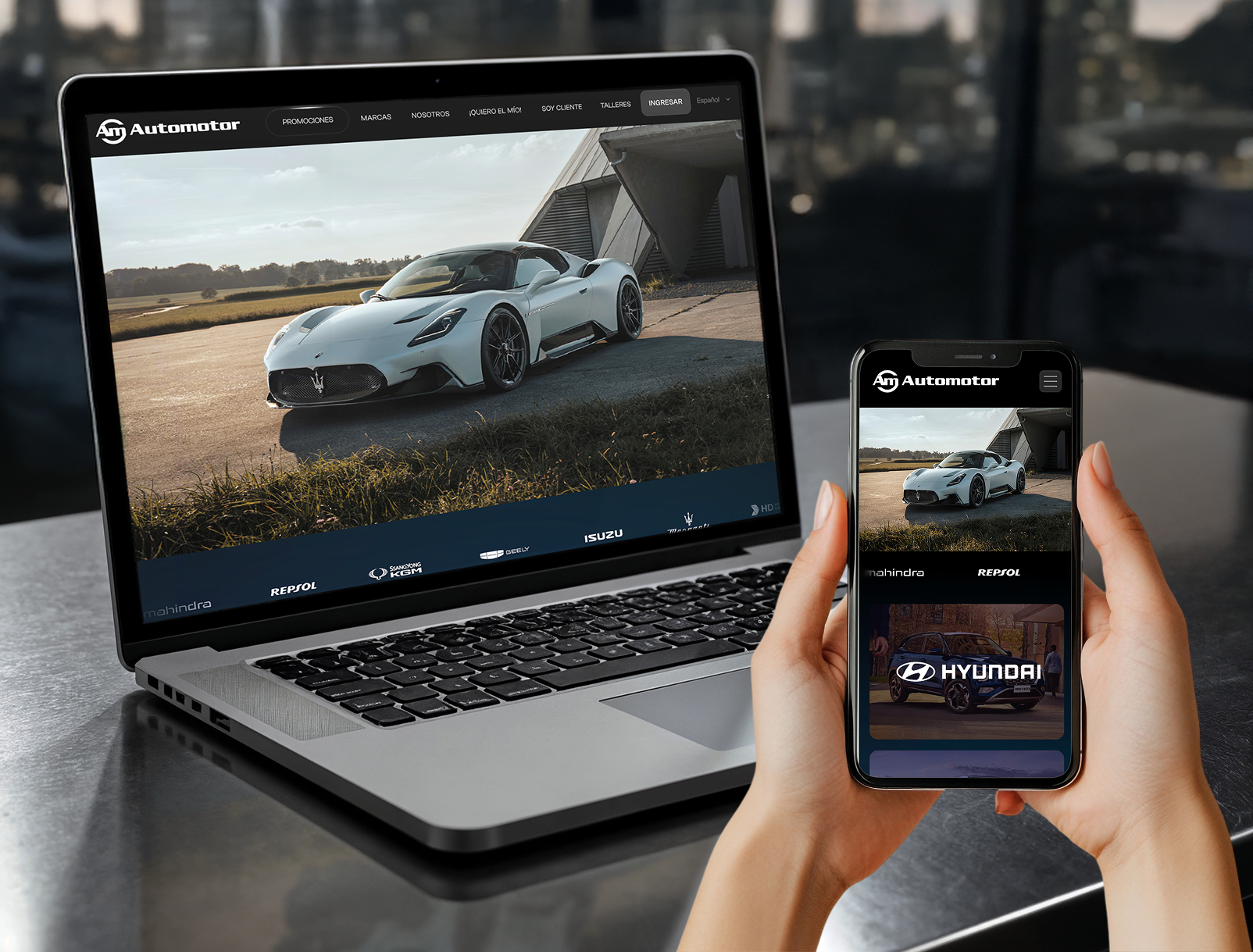
Automotor is Paraguay's multi-brand vehicle group — Maserati, Hyundai, Hyundai Camiones y Buses, Hyundai Construcción, Isuzu, Geely, KGM, Mahindra and Repsol, plus a used-vehicle arm — running showrooms, parts counters and authorised workshops across four cities.
The site I inherited was a full-screen brand carousel: one brand per slide, dot navigation, no visible menu. There was no route to booking a service or finding a branch. It was organised around how the company is structured internally, not around why anyone was visiting.
Research: who actually arrives here?
I started with one question — ¿Quiénes acceden a automotor.com.py?/Who visits automotor.com.py? — and mapped every group that lands on the domain against what they came to do. Three emerged, and they have almost nothing in common: people shopping for a vehicle, existing owners who need a service appointment or a part, and authorised independent workshops with their own login.

Mapping it surfaced two structural questions the brief hadn't answered, and I sent both back to the client before designing a single screen — because either answer changed the navigation. Are "Sucursales" and "Talleres" different things to a visitor, or just different departments internally? Should the customer login and the workshop login be one entry point or two?

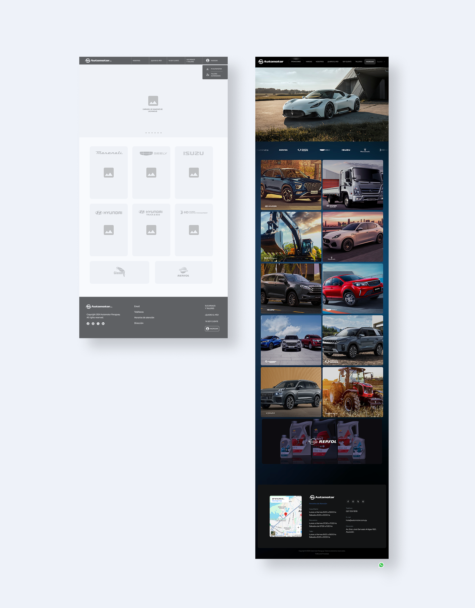
The wireframes resolved both. The two logins stayed separate — Mi Automotor for owners, Talleres Autorizados for workshops — because merging them would have forced every visitor to identify themselves before the site could help them. And "Sucursales y Talleres" split into two, because a visitor looking for an address and a visitor booking a repair are not doing the same thing.
The navigation changed again between wireframe and launch: Promociones and Marcas were added once it was clear buyers arrived wanting both.
The problem. The previous site organised its content around how the company was structured internally rather than around why anyone was visiting. Nine brands and three unrelated audiences shared one homepage, so every visitor scrolled past two-thirds of a page built for somebody else.
Three decisions
1. I named the navigation by intent, not by department — "¡Quiero el mío!" for buyers, "Soy cliente" for owners, "Talleres" for workshops. Labelling the doors by what the visitor wants lets people sort themselves in one click.
2. I kept the phone number permanently beside the booking button. Form-only would have been cleaner, but a real share of this market still books by calling, and a form-only design loses those bookings rather than converting them.
3. I published three separate sets of opening hours instead of averaging them. The showroom, parts counter and workshop close at different times on Saturdays. One tidy line is better typography and worse for the customer standing outside a closed parts counter.


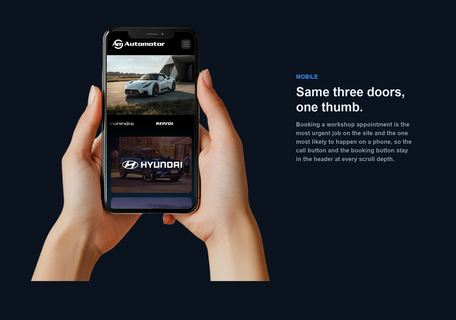
Build. Designed in Figma, built and shipped in Framer rather than handed off. Twenty-one branch pages across four cities, Spanish-first with a language selector.
I still run the site. I publish the promotions, adapt each campaign's key visual to web, and keep the vehicle range current across nine brands — so the design system gets tested against real content every month instead of being handed over and left to drift.
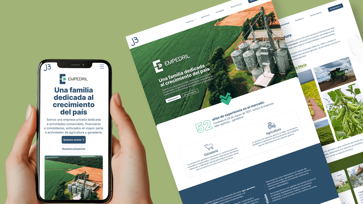
Outcome. Automotor's parent group has retained me since 2024 across four companies — Automotor, Carmotor, Empedril and BOGA — including ongoing maintenance of this site. Four production sites, one client, two years.
Sole designer: research, information architecture, navigation, desktop and mobile UI, branch page system, and the Framer build.